**Disclaimer: This project was created as part of a design course and is a conceptual piece. It is not affiliated with, sponsored by, or officially associated with Chobani.
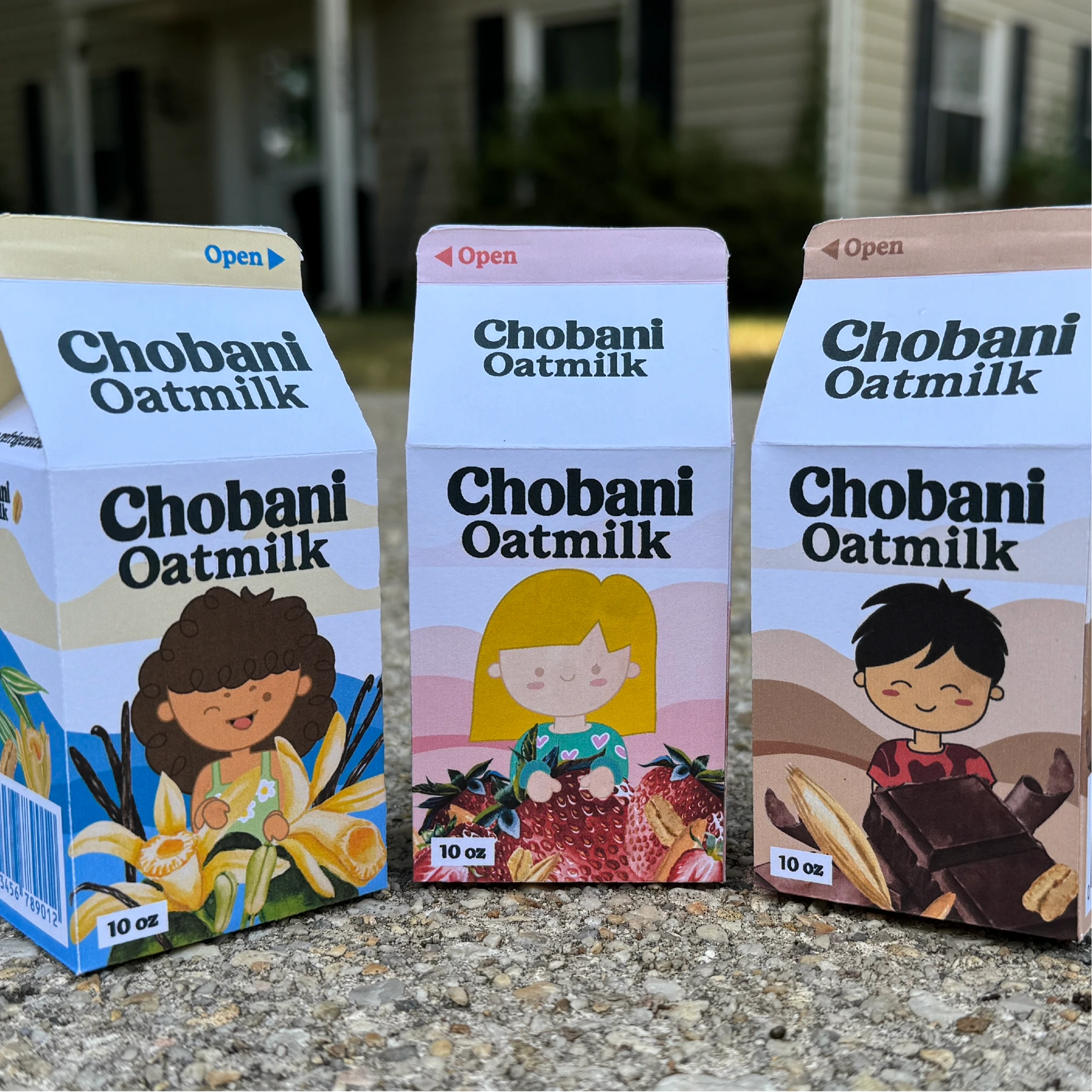
This project reimagines Chobani’s packaging for a kids’ milk product, focusing on a playful yet clean design that appeals to children while maintaining the brand’s wholesome and natural identity. The goal was to create engaging packaging that stands out on shelves and communicates Chobani’s commitment to quality and nutrition.
My Approach
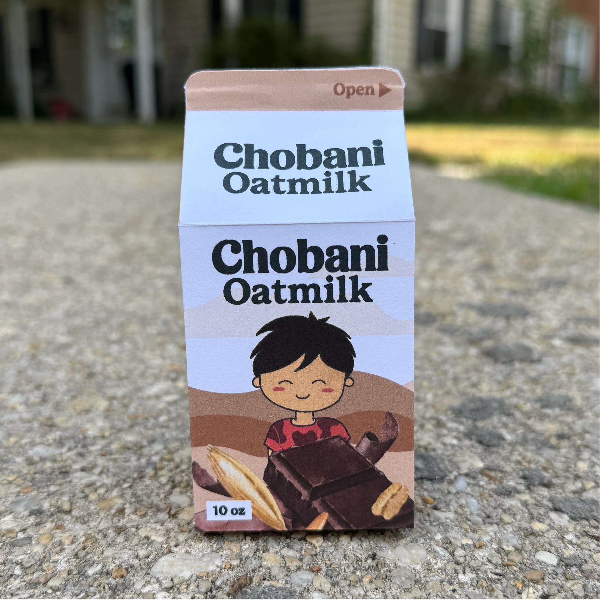
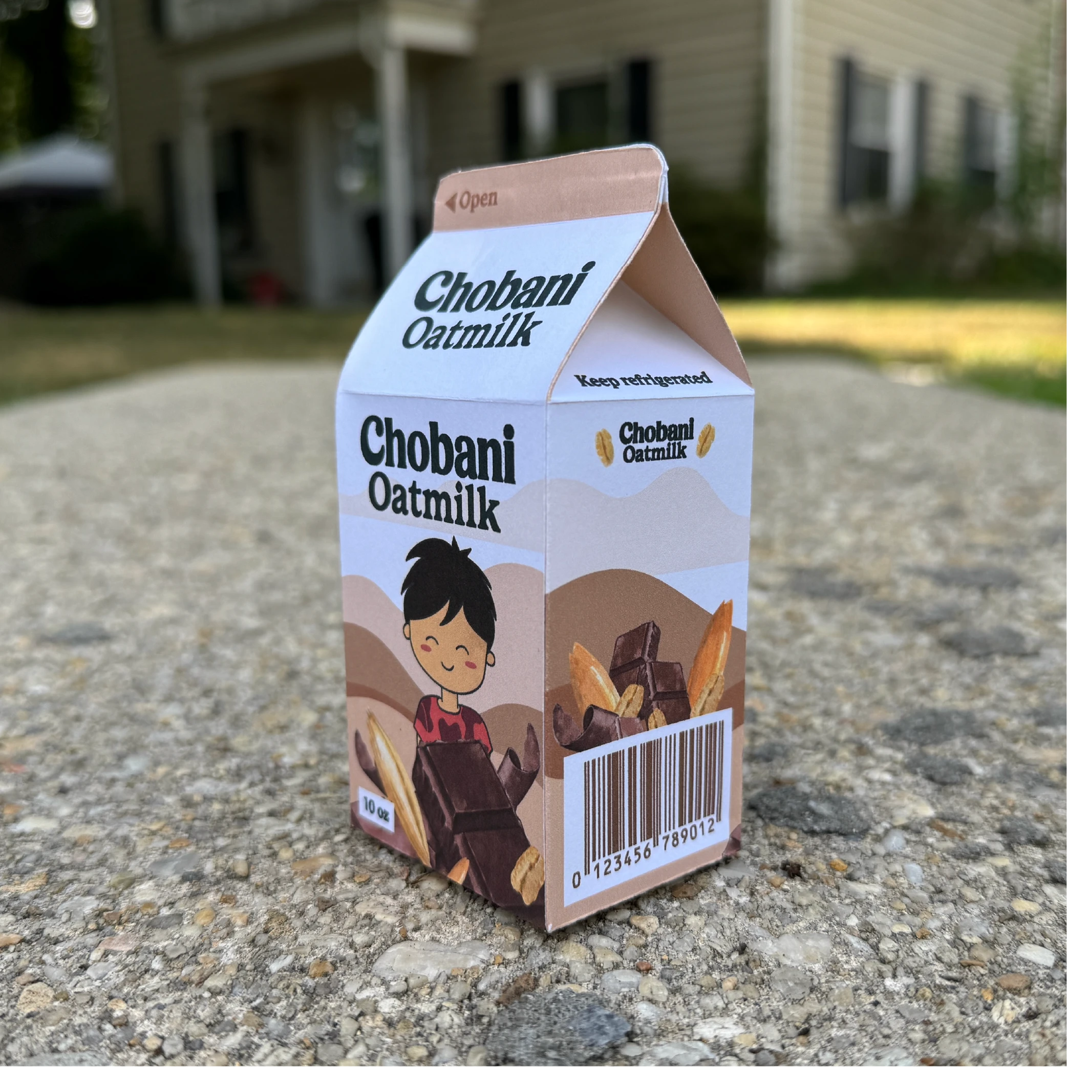
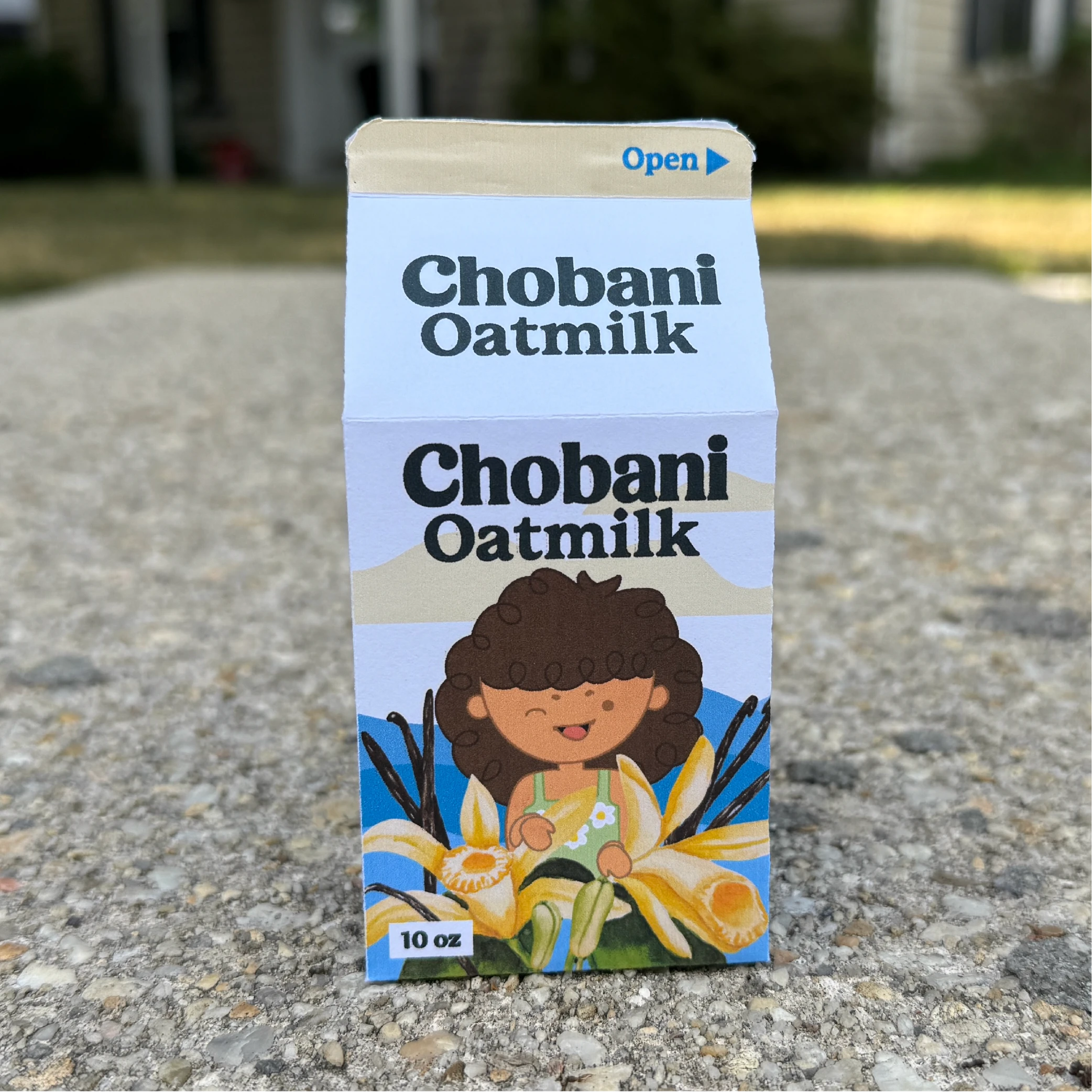
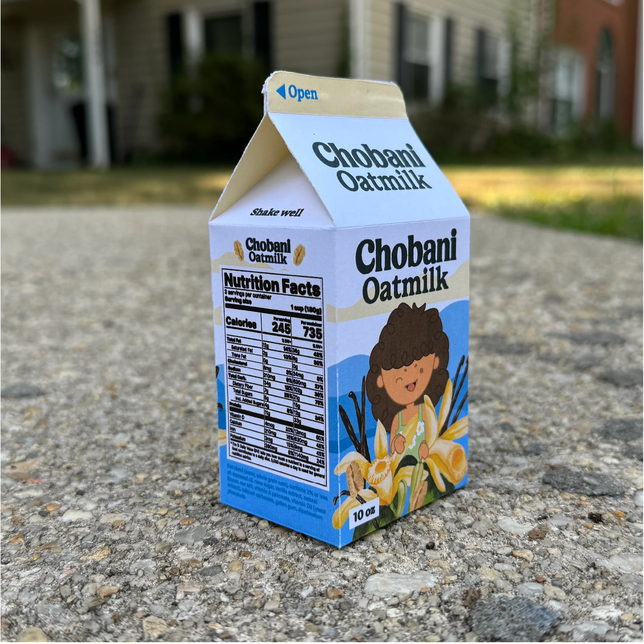
I approached this project with the goal of creating packaging that feels both fun and educational. I wanted the designs to spark curiosity in kids while reassuring parents of the product’s nutritional value. Using soft watercolor illustrations of ingredients like strawberries, vanilla, and chocolate, I brought a natural, hand-crafted feel to the packaging. The clean layout and balanced typography ensure the design remains approachable without becoming overly busy. The use of vibrant colors helps distinguish flavors while maintaining visual consistency across the product line.
Identifying Unique Challenges
Chobani is known for its fresh, healthy dairy products, but designing for kids presents a unique challenge—balancing playful, eye-catching design with a clean, wholesome aesthetic that parents trust. The objective was to create packaging that not only grabs the attention of young consumers but also aligns with Chobani’s brand values of health, quality, and sustainability.
The Process
Research & Brand Study
Analyzed existing Chobani packaging to maintain brand consistency while introducing playful elements for kids.
Studied competitive kids’ milk packaging to identify opportunities for visual differentiation.
Concept Development
Chose a dieline that allows for full visibility of branding and playful illustrations.
Created mood boards to establish the soft, hand-crafted aesthetic using watercolor textures and friendly fonts.
Design Execution
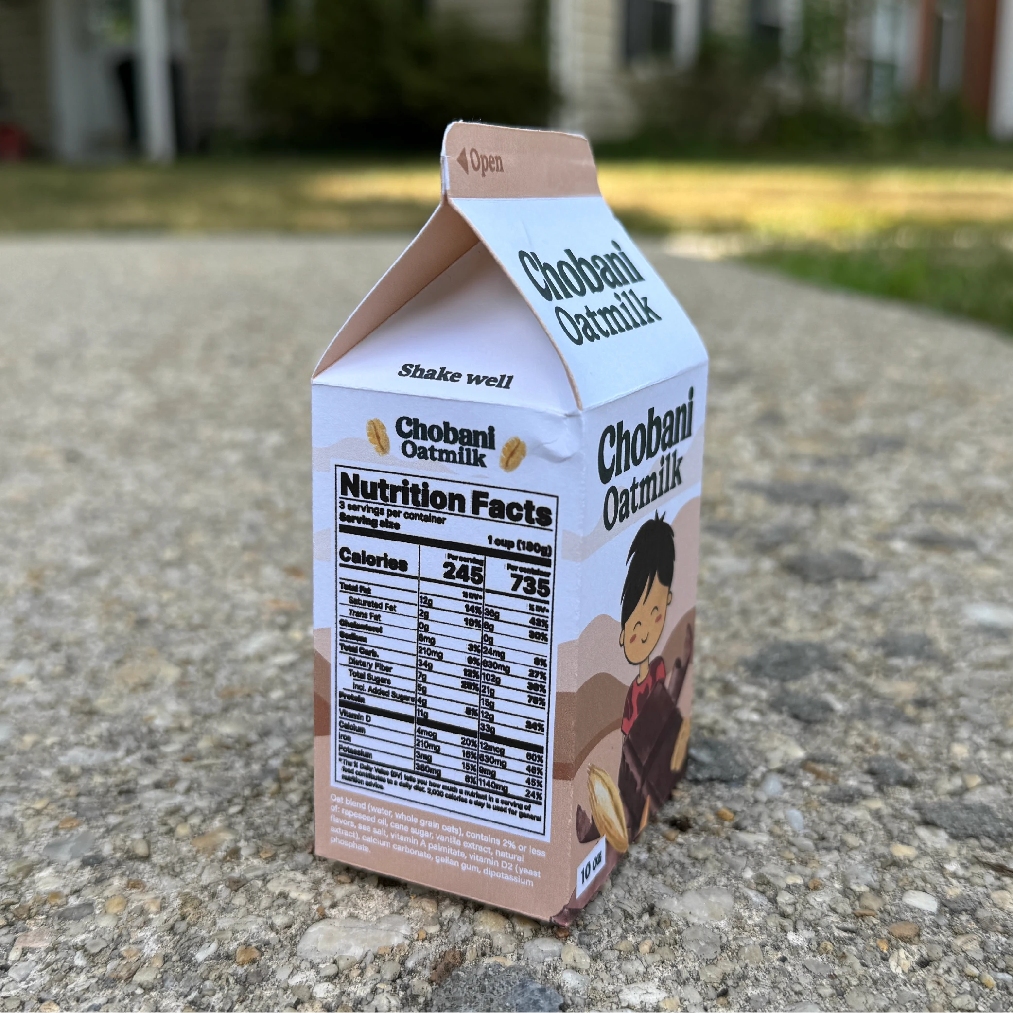
Developed packaging for three flavors: Vanilla, Strawberry, and Chocolate, each highlighted through distinct yet cohesive color palettes.
Integrated hand-drawn ingredient illustrations to emphasize Chobani’s commitment to natural ingredients.
Ensured important elements like nutritional facts and branding remained clear and easy to read.
Final Deliverables
Full Packaging Suite
Mockups
Brand Consistency
Conclusion
The Chobani Kids Milk packaging project merges playful design with brand consistency, creating a product that appeals to both kids and parents. This project allowed me to explore the balance between fun and functionality in packaging, while honing my skills in dieline creation, illustration, and brand storytelling. The final result is a vibrant, engaging design that stands out on shelves while maintaining Chobani’s trusted, wholesome identity.