Washington, D.C.

Category:
Print | Digital
Katherine Cabrera


Katherine Cabrera
Designer
I wanted the designs to feel like standing under the blossoms, bright, joyful, and full of life.
Highlights
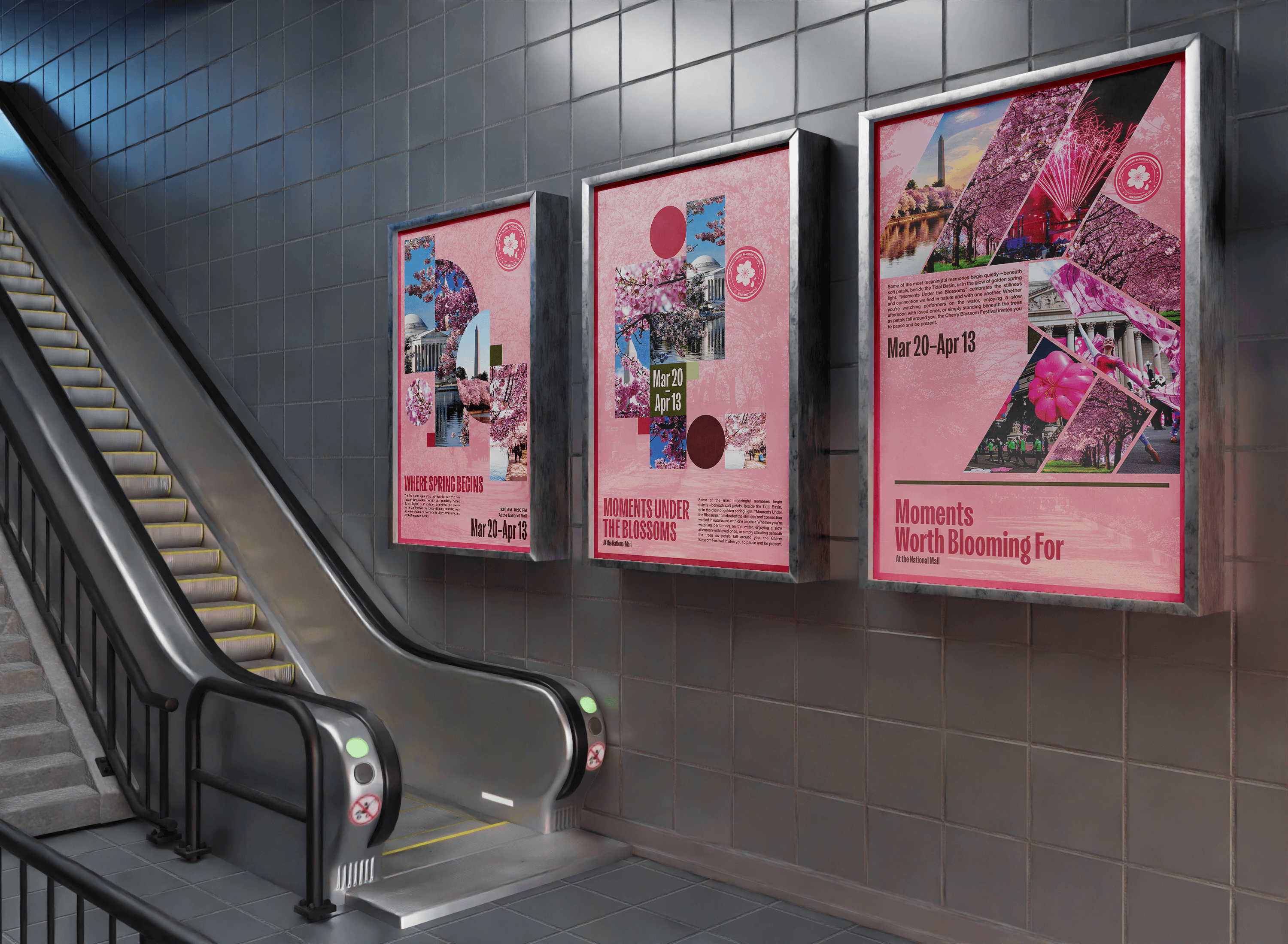
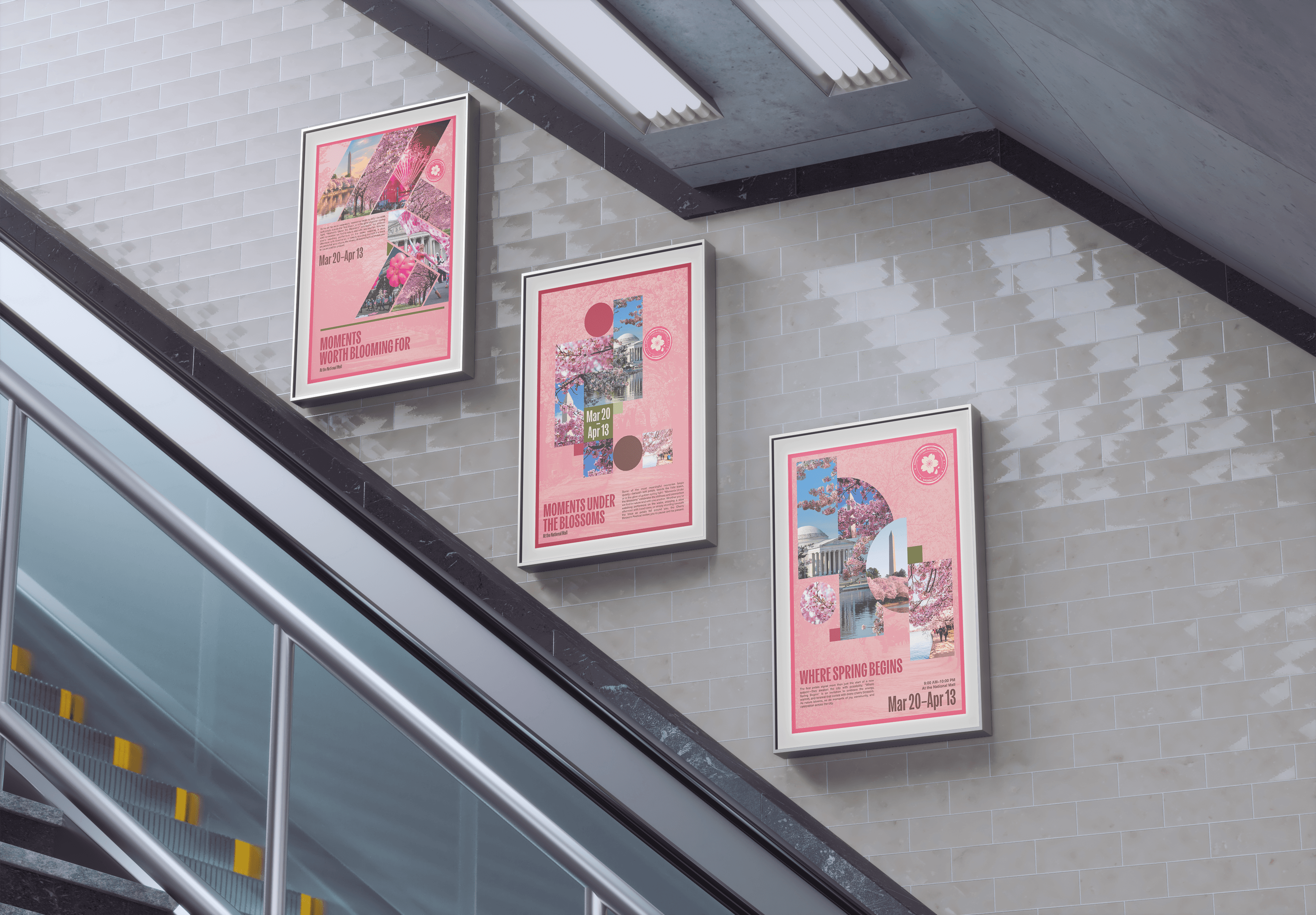
Vibrant Visual Language
The campaign’s core identity is built around a bold, uplifting palette and layered floral motifs that immediately evoke the arrival of spring. Each element was carefully chosen to capture the joy, movement, and anticipation of the festival. This ensures every piece, from posters to merchandise, radiates the celebratory spirit of the event.
Cultural Connection
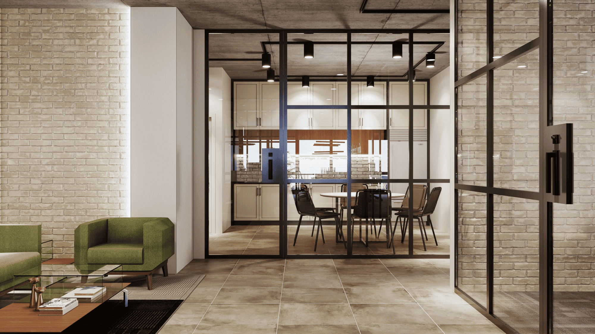
A functional yet stylish space designed for effortless cooking and entertaining. The cabinetry, finished in light, neutral shades like white or soft gray, is paired with natural wooden countertops that add warmth to the clean design. Open shelving above the countertops showcases neatly arranged ceramic dishes, glass jars, and small potted herbs, blending beauty with functionality.
Multi-Platform Cohesion
From posters and programs to merchandise and social media, the campaign was built to adapt seamlessly across platforms. Defined type styles, adaptable blossom motifs, and consistent color applications kept the system unified while flexible. This cohesion builds recognition and excitement across every audience touchpoint.


Details
Color Palette
Bright pinks, fresh greens, and warm yellows accented with soft neutrals to balance vibrancy with elegance, reflecting both the blossoms’ seasonal beauty and brand legibility.
Materials and Textures
A modern sans-serif system using weight and scale to create hierarchy and clarity. This keeps messaging accessible while letting illustration and color provide energy.
Illustration & Texture
Hand-drawn blossom motifs layered with clean vector elements to create depth, motion, and tactility. These textures reinforce the floral theme while keeping the brand contemporary.