Aug 18, 2024

Aug 18, 2024
Aug 18, 2024

Bamban Sushi

Bamban Sushi

Bamban Sushi

Crofton, Maryland

Category:

Digital

Client:

BamBan Sushi

Katherine Cabrera

Designer

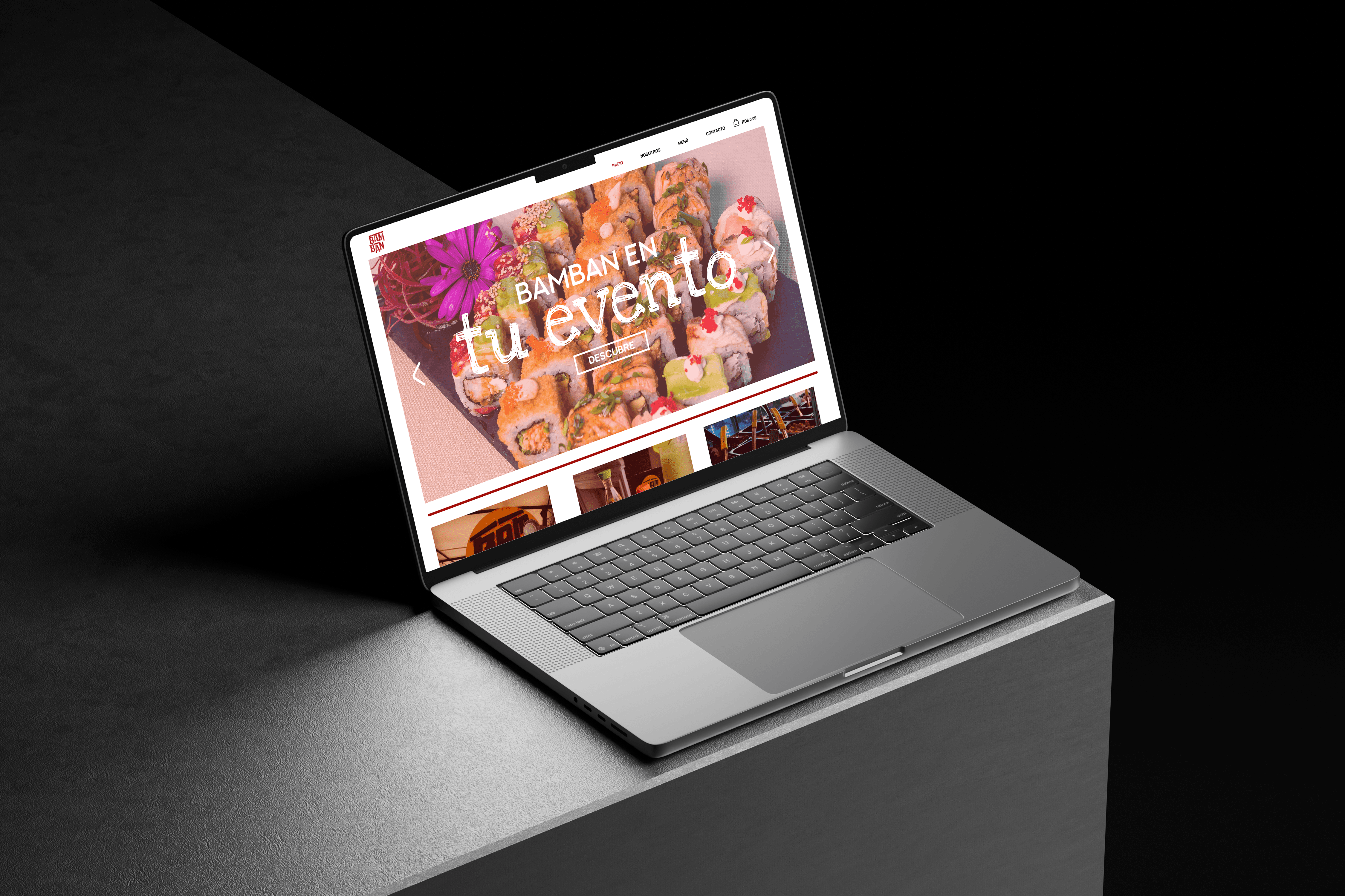
I wanted the website to feel as bold and flavorful as BamBan’s sushi itself, bright, exciting, and impossible to ignore.

This project was inspired by the fusion of cultures at the heart of BamBan Sushi. I wanted to create a digital space that felt as vibrant and flavorful as the food itself, while still being easy to use. By pairing bold colors, playful typography, and a clean layout system, I built a site that not only communicates the restaurant’s personality but also makes the ordering process seamless and enjoyable.

This project was inspired by the fusion of cultures at the heart of BamBan Sushi. I wanted to create a digital space that felt as vibrant and flavorful as the food itself, while still being easy to use. By pairing bold colors, playful typography, and a clean layout system, I built a site that not only communicates the restaurant’s personality but also makes the ordering process seamless and enjoyable.

BamBan Sushi blends Dominican vibrancy with Japanese culinary tradition, creating a brand identity that feels fresh, approachable, and full of personality. The goal of this project was to translate that brand essence into a digital platform where customers could easily explore the menu, learn about the restaurant, and place orders online. The website design uses a bold, energetic palette inspired by fresh ingredients and Dominican culture, paired with clean layouts to maintain usability. Typography choices balance playful character with legibility, while imagery and iconography highlight the fusion of flavor and culture at the heart of the brand. Wireframes and prototypes ensured the user journey felt intuitive, fast, and enjoyable.

BamBan Sushi blends Dominican vibrancy with Japanese culinary tradition, creating a brand identity that feels fresh, approachable, and full of personality. The goal of this project was to translate that brand essence into a digital platform where customers could easily explore the menu, learn about the restaurant, and place orders online. The website design uses a bold, energetic palette inspired by fresh ingredients and Dominican culture, paired with clean layouts to maintain usability. Typography choices balance playful character with legibility, while imagery and iconography highlight the fusion of flavor and culture at the heart of the brand. Wireframes and prototypes ensured the user journey felt intuitive, fast, and enjoyable.

BamBan Sushi blends Dominican vibrancy with Japanese culinary tradition, creating a brand identity that feels fresh, approachable, and full of personality. The goal of this project was to translate that brand essence into a digital platform where customers could easily explore the menu, learn about the restaurant, and place orders online. The website design uses a bold, energetic palette inspired by fresh ingredients and Dominican culture, paired with clean layouts to maintain usability. Typography choices balance playful character with legibility, while imagery and iconography highlight the fusion of flavor and culture at the heart of the brand. Wireframes and prototypes ensured the user journey felt intuitive, fast, and enjoyable.

Project gallery

Project gallery

Project gallery

Highlights

Cultural Fusion in Design

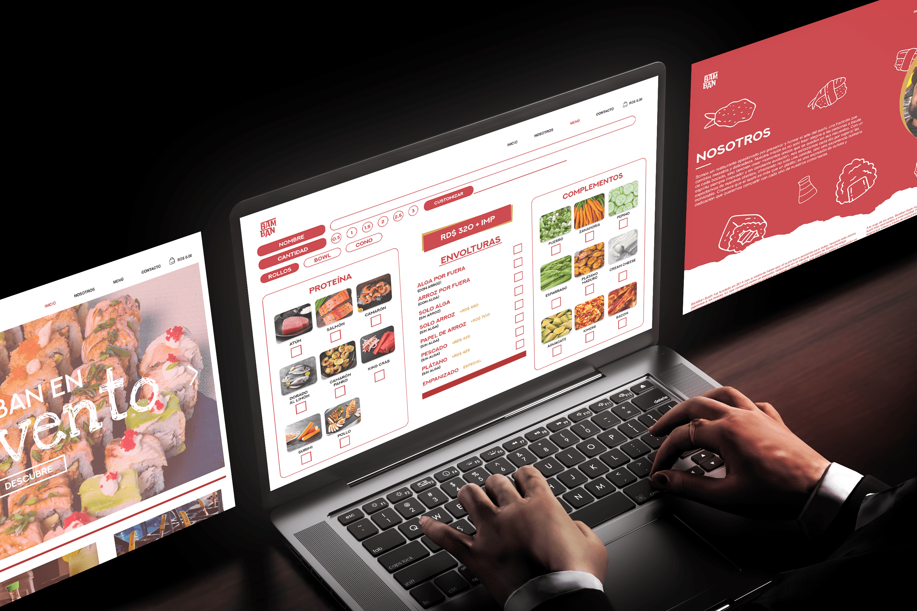
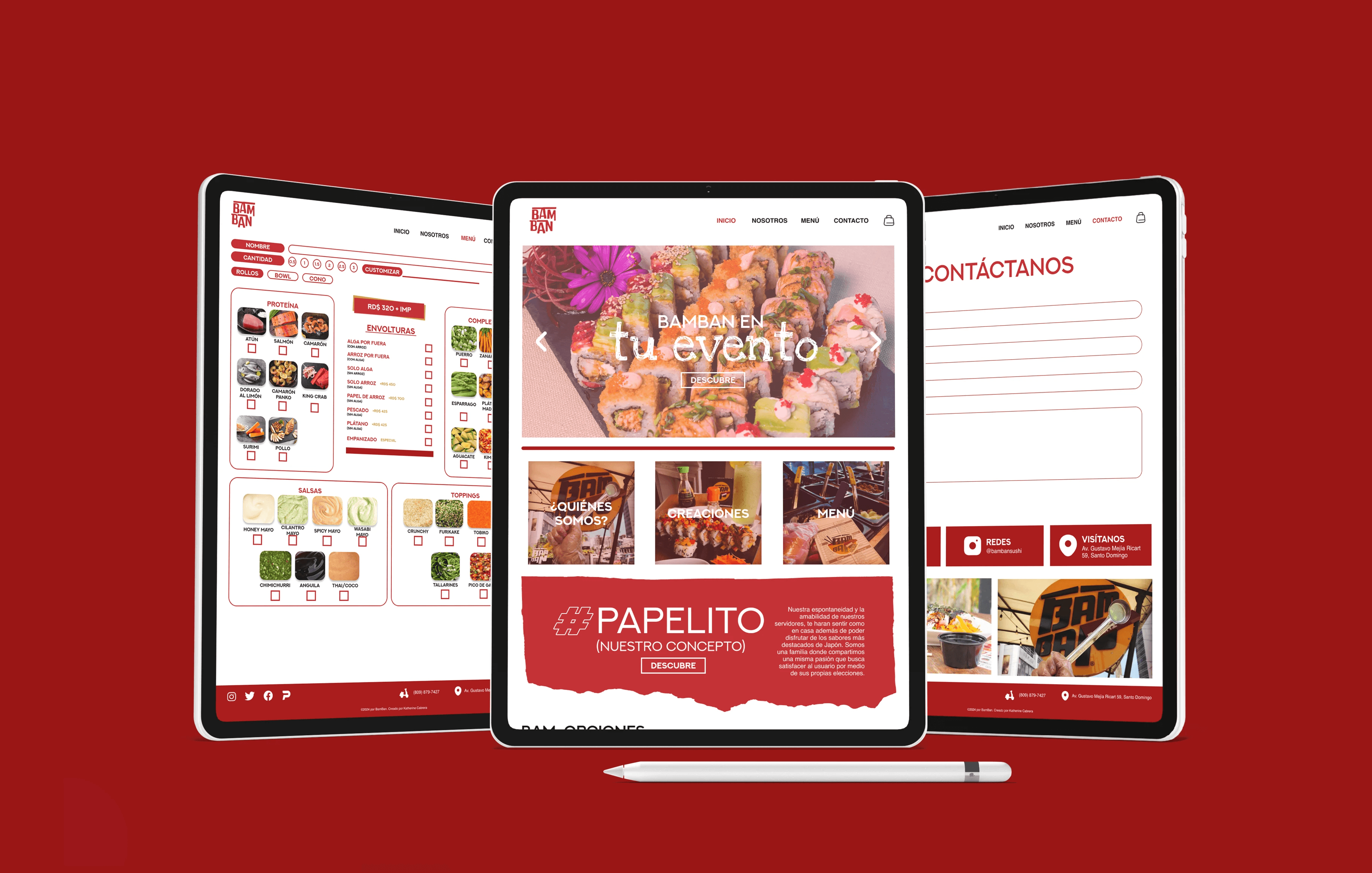
The website’s visuals incorporate Dominican-inspired colors and playful energy while maintaining Japanese culinary influence. This creates a unique aesthetic that feels authentic, bold, and memorable.

User-Friendly Experience

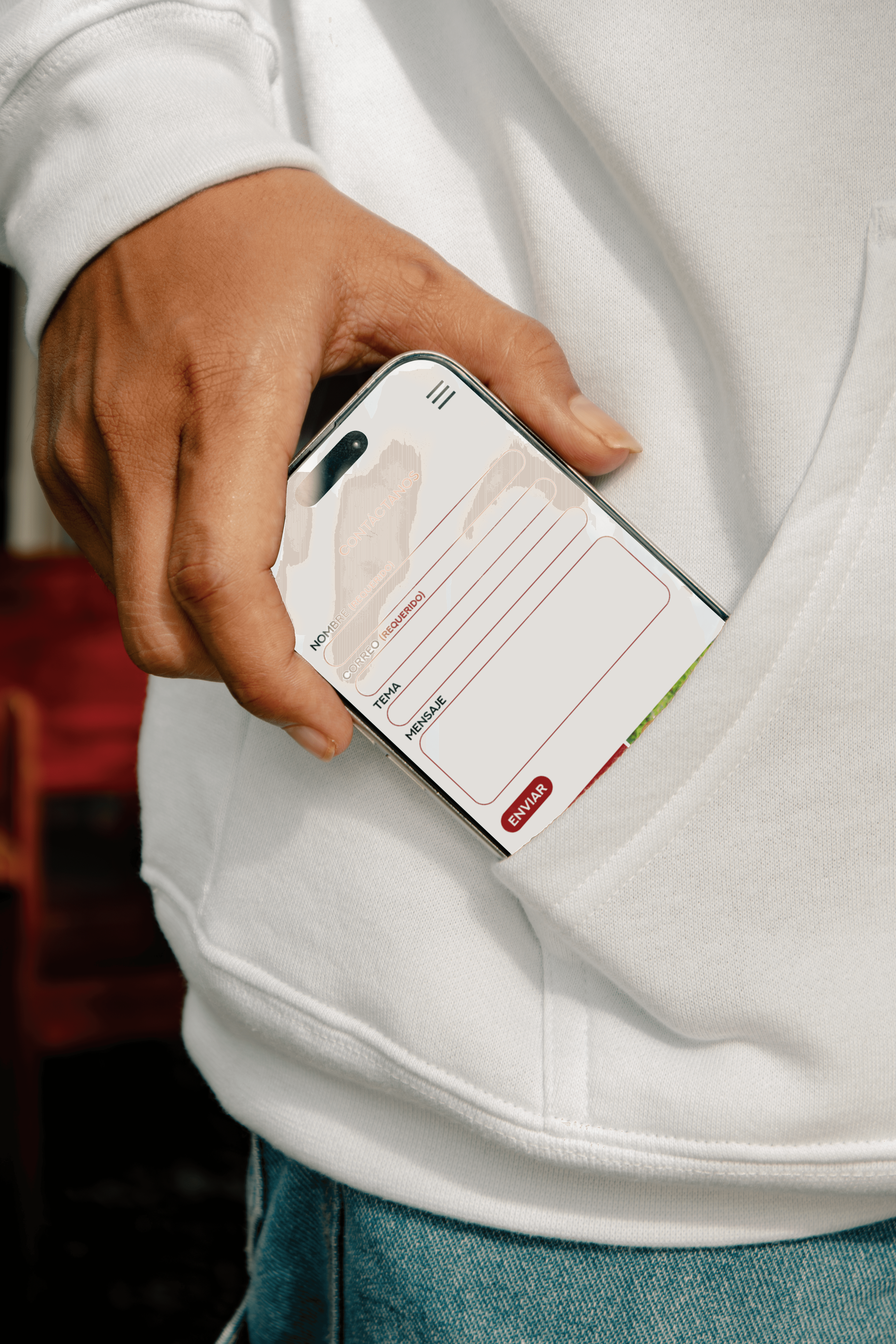
The site prioritizes intuitive navigation and clear hierarchy, making it easy for customers to explore the menu, find promotions, and place orders. This balance of fun and functionality ensures the brand’s personality shines without sacrificing usability.

Vibrant Visual System

Bright colors, playful typography, and bold imagery highlight the freshness of the food while reinforcing the brand’s youthful, energetic tone. The system creates visual excitement that mirrors the restaurant’s dynamic menu.

Details

Color Palette

Vibrant reds, fresh greens, and bold yellows inspired by ingredients and Dominican culture, balanced with neutrals for readability and contrast.

Typography

Playful sans-serif fonts with varied weights establish hierarchy while maintaining clarity across both desktop and mobile platforms.

Imagery & Icons

High-quality food photography and custom icons highlight the freshness of the menu and bring out the fusion personality of the brand.